Improving Website Accessibility in the Tourism Industry
Prospective travelers are searching through tourism websites to plan their next vacation, yet some of these sites are not providing complete access for everyone. For many users, browsing the web isn't quite as simple as clicking a mouse.
Did you know that almost three-quarters of websites are not accessible to those with disabilities? Over one billion individuals across the globe have a disability or impairment that impedes their ability to navigate the internet (for example, autism, ADHD, hearing loss, and more).
People with special accessibility needs require certain modifications in order to access information online. Having an accessible tourism website makes it so that everyone can view the information and decide if your destination is suitable for their next holiday.
Check out our list of must-haves for designing an accessible website!
1. Alternative (alt) Text For Images. Including alt text for images enables people with visual impairments to be given a description of the photo. Without alt text, users of assistive technology for visual challenges won't have any information about the image.
2. Use Subtitles For All Audio Or Video Content. For audio or video content, make sure to supply transcripts or subtitles so hearing-impaired individuals can access the entire content.
3. Text Formatting. Ensure that text can be readily formatted for different sizes to accommodate people with visual impairments. Don't format the text as a PDF, since that would impede enlarging it.
4. Website Navigation. Assistive technologies can impede website navigation, which creates obstacles for users who rely on them. The Disability Services Commission recommends designing websites that can navigate without a mouse to accommodate keyboard and voice-activated assistive technology.
5. Use of Colour. People with visual impairments or color blindness may not be able to interpret information that is communicated solely through color. Therefore, WCAG recommends using alternative forms of communication alongside colors. For example, you could use an asterisk to indicate required fields instead of using red.
A website that is easy to use is no longer a "nice to have." It is a necessity for businesses, particularly in the tourism sector.
The complete Web Content Accessibility Guidelines (WCAG) 2.0 can be found HERE...
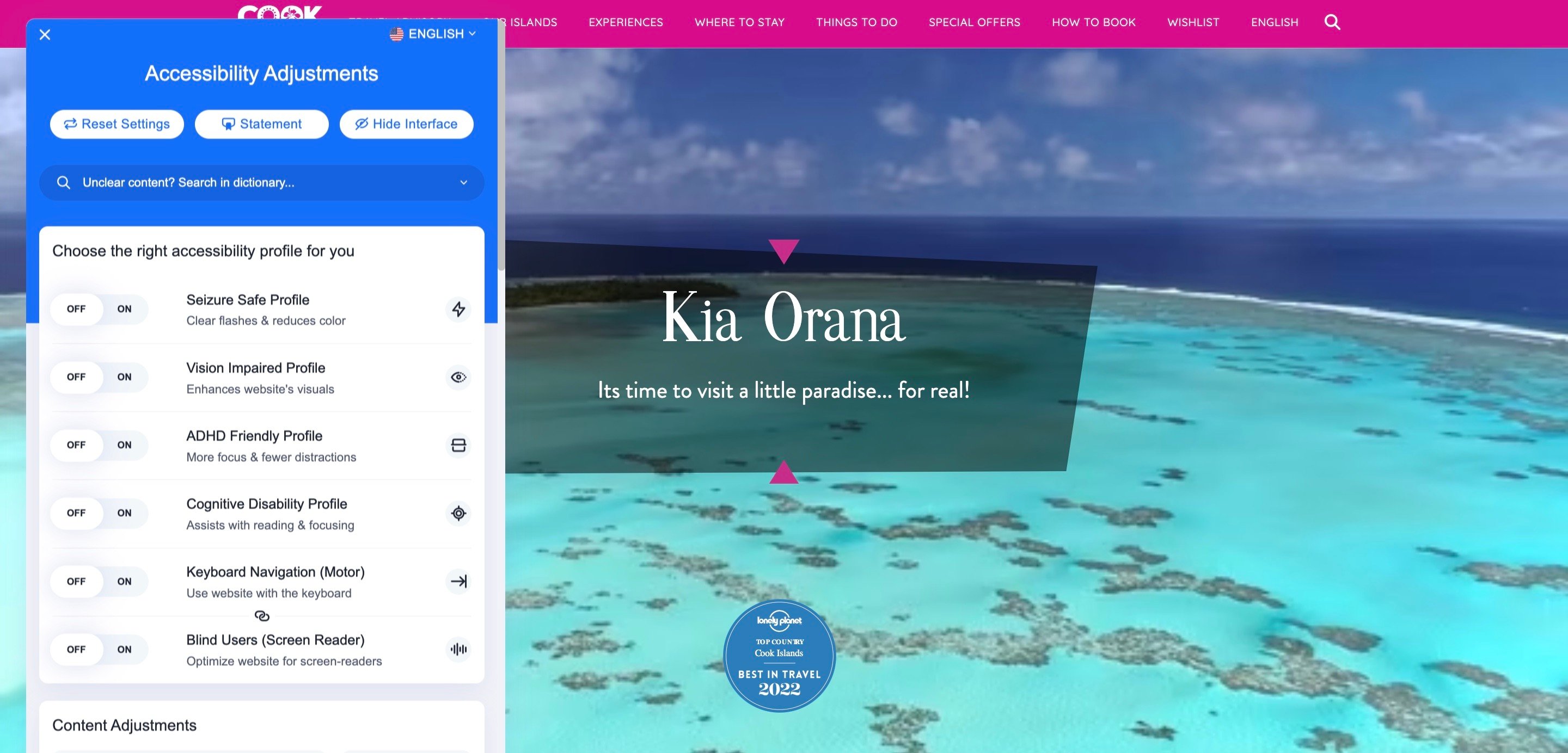
Do you have impairments with hearing, sight, cognition, learning, or physical movement? Why not try out our accessibility adjustments and explore our website further! Adjust to your needs by simply clicking the blue person icon in the bottom left corner of your screen.
References
Navigator Multimedia
Access Design Studio